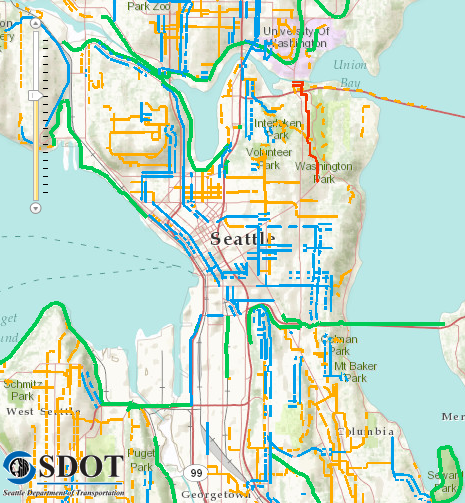
To kick off Bike Month and the Bicycle Master Plan Update, the city has launched some new online tools to help people find good bike routes and make recommendations for changes.
First off, the city’s new online bike map goes well beyond simply posting the PDF of the print bike map, as in previous years. The new map is interactive and even lets you choose your level of confidence so you can avoid busy roads with sharrows or skinny bike lanes. The print map simply labels all bicycle facilities, which can be confusing or misleading to newer bikers. For example, if a busy street (like 45th in Wallingford) has sharrows, it will be marked on the bike map even though that is the last street I would suggest to a beginner. The online map lets you see only the roads that are slower and more comfortable for cycling.
The map does not allow for routing directions (apparently the software to do that is crazy expensive). But it could be a good tool for people who want to get started and want to know which slower streets are good options.
City wants to know trouble spots in your bike route
As the city kicks off the Bicycle Master Plan update, they want to know all the spots in the city that give you trouble or make you feel unsafe. And since they have this new online bike map, they are using that software to collect survey data. Go to the survey website and follow the steps on the right to mark issues on the map.
Here’s a video explaining the survey:
Pretty cool, huh? So have at it and tell the city all about your issues, intersection by intersection. And you can skip parts of the survey if you don’t have time to do it all. Just send them whatever info you can.
UPDATE: Note that the survey map saves and clears every two minutes. So if your marked routes disappear suddenly, don’t worry. It has been saved.


Comments
15 responses to “City launches new interactive bike map, bike plan survey”
I disagree with the city calling the path on the west side of South Lake Union a “separated trail”. If that’s the case, then the sidewalks in front of the stores and through the parking lot at U Village should qualify as well.
Agreed. It’s just a sidewalk and then a bit of riding through parking lots. I took this “trail” once and then just said screw it. Now I only take Dexter while riding on the west side of Lake Union.
This seems like a pretty big issue. It’s a path that most cyclists I know avoid (due to the danger of pedestrians, business’ doors opening, cars pulling into and out of parking spots, weaving through strange turns, etc.) but it’s marked with a big green line on the official bike map. If I were a new rider trying to get from downtown to Fremont, I’d gravitate toward that big friendly green line. It’s dangerous for the city map to be so deceptive.
Pretty cool. One suggestion: It would be nice if the legend was visible on the same screen, like somewhere in that big white space on the left.
Agreed. At least a simplified legend that shows the most important info.
I agree that the legend needs to be visible to the user. I have been looking at this tool a lot in the last few weeks and never would have guessed that it was the finished version I was trying out, but apparently it was.
To be clear, I totally love this tool and would love to high-five the nerds responsible for it. Once I learned how to use it it has been a blast to play with. I find the user-interface to be pretty baffling, though. I hope that it can still be cleaned up and made more user friendly before too many folks try it, get frustrated and give up on it.
Those are my 2 cents.
I assume that I should be able to click on the “Frequent Rider” panel in the upper left to see a drop-down of other difficulty levels, but nothing happens when I click.
Also, agree that the Westlake parking lot is not a “separated trail”.
SDOT has been going for the Gold in my book lately.
There is a small stretch of “Ravenna Blvd. that runs between Lake City Way and then turns into NE 25th St. in Wedgewood. I’ve been riding this stretch daily for 10 years and had given up hope that SDOT was going to do anything but patch the worst holes on it.
But lo’ and behold they resurfaced the whole darn thing, right along with the other section of Ravenna (how they are the same street, I have no idea….) and it’s a thing of beauty.
I also noticed a street sweeper has made it’s way up and down Lake City Way, making the shoulder more bearable for cyclist.
I need to email those folks and tell them how much I appreciate their work.
Sorry, I saw your post and got distracted.
Thanks for mentioning that it saves and clears–I sketched in one route a couple of times this morning before giving up, thinking my data was gone. Glad to know it got saved!
Probably it said so in the directional video. I really should get better at reading directions before diving in.
Sort of odd that Taylor going up to the top of Queen Anne is not marked with steep street chevrons. That climb might not register for a seasoned cyclist, but a new rider might find it challenging. Looking at the map, I’d have no idea I was looking at 4/5ths of a mile at 6% grade.
I can’t figure out for the life of me how this map works, and I work in usability.
As much as a love this thing I just wish the city would resurface & hit existing roads with street cleaners more often, upgrade the paint they are using for bike lanes and sharrows (U-Dist bike lane paint is almost completely worn off in only a year). I live on Brooklyn Ave in the Ravenna area and the street has been completely covered in glass for the past year & I’ve lived here for 2.5 years and never seen a sign that says “no parking on west side of this road during these days because of street cleaning”. I feel like this is a secret plot by Schwalbe to force everyone to buy their tires or something. Maybe they have sales reps that visit each town and pours sugar in the street cleaners gas tanks. Who knows.
I appreciate the leaps and bounds SDOT has made with Bicycle infrastructure of late but we really need to boost the transportation budget in this town, it’s either underfunded or super inefficient.
Every time my parents visit they are astounded at our road conditions. They always remark “You guys don’t even have Snow/Ice/Road-salt to deteriorate your roads, why the hell do your roads suck so much?”
Ok, I managed to get some routes input… but it’s interface is awful. I hate that I can’t seem to remove points from a route I’m putting down.
I was so excited about the survey from your post, I went straight to it. Unfortunately, I have no idea how to input a darn thing. I’m glad there’s a survey, but it needs some serious usability help. It shouldn’t take people more than 30 seconds to get their bearings, and I spent 2 minutes trying to figure it out before I gave up.
Ok the trick to this interface is, first click on the question you’d like to answer. (order doesn’t matter.) Then double click on the map to start the route, click on each turn, and double click to end the route. Then just close the window if you like what you did.
Hard parts, to get the map to move you have to click and drag. I’ve had it drop the next point off in lala land and I haven’t found out how to remove a bad point. So I did short routes. You can cancel the route once you finished and it disappears.
Also watch out, if you click in the lower right corner of the map on the logo, it takes you to the site provider’s website. … (wtf?)
What I want, the ability to move the intermediate lines like you can on google maps.