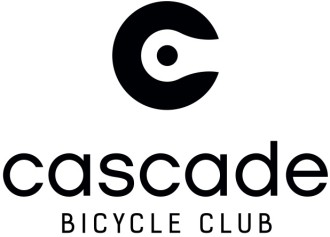
 Cascade Bicycle Club has unveiled a new logo for the new year.
Finally bidding farewell to the long-running, sans-serif-in-italics logo. The new logo has a more corporate and clean look featuring a “C” wrapped around half a chain link.
The logo change comes amid a string of changes at the club since Elizabeth Kiker took control of the organization in September.
Here’s how Cascade’s leaders see the new logo:
“This clean, clear and effective new logo will help us communicate with members, volunteers and partners in the Puget Sound region,” said Elizabeth Kiker, executive director. “When people see the bold C and chain link, they will immediately connect it to the Cascade Bicycle Club.”
“The designers captured our bold vision and our commitment to the community with the new logo,” said Anne-Marije Rook, Director of Communications.“Kotis has been a valuable partner for many years and they understand the Club and our mission. We’re proud and excited to start 2014 with a new look.”
Here are their past logos:


Comments
23 responses to “What do you think of Cascade’s new logo?”
Their former one was pretty ugly. While I am resistant to the corporate look that so many non-profits have gone for, this one is an improvement.
“… The new logo has a more corporate and clean look ..”
Gross. No thanks.
LOVE the new logo!!! Not as in love with the text/logotype, but I think it will work really well.
When i look at the logo, the first thing that comes to mind is Colorados state flag and the pac man. In my opinion this is a poor decision for their logo. At least the previous logos had the name of the organization and most importantly a sense of speed. I am however, happy that the CBC feels the designers captured the “bold vision” of their freds.
A good improvement. Text/write-up that went with it is a bit much. Always laugh at how often the word “bold” gets used with new logo launches.
Two different fonts for the name, one word in all lowercase, the next two in all caps. Awful.
It’s a big meh for me. When you have a good logo there really is no reason to change it just for the sake of change. Some new logos aren’t better at all. Seattle’s Best Coffee’s new logo is crap. UPS’ new logo is crap. Bell Canada’s new logo is horrible. The only reason to change your logo is if the present one is deficient. The new Cascade logo looks like a ripoff for the state of Colorado or Comedy Central.
Ugly, but recognizable even at a very small size for web use.
Not sure when they changed their name to “cascade BICYCLE CLUB,” but intentionally bad capitalization does seem to be a corporate trend.
The “C” at the top is …..ok
The rest is cr*p. Terrible font. No sense of history or the mission of the club. But what do I care, I stopped being a member after I realized how useless the club is for me.
They might have done better to hire a graphic designer, who would have immediately realized the Colorado flag rip-off was a bad idea and that mixing the fonts like they did was a bad idea also.
I had some really mixed reactions to the logo. Professionally, I’m a design researcher, so this is sort of my field. But I’m also tired, so this won’t be super cogent.
Apologies in advance if I offend anyone involved (especially as it was done laudably as a volunteer project, and I know it’s no fun to volunteer and get knocked down by people for your hard work.)
I really have one big objection to the logo: it just doesn’t seem to support the biggest organizational goals that I think of Cascade moving towards, namely, appealing to a broader audience beyond existing cyclists, and rebranding itself towards being a family-friendly organization. It really falls short compared to some of the other great logos that have come out right now (People for Bikes, League of American Bicyclists, etc).
I think I am pretty representative of the audience that Cascade is trying to attract (people who like the idea of incorporating bicycling into their lives but are not ‘cyclists’), and I have to admit it took several explanations from a friend to even understand what the logo was supposed to represent. I originally thought it was a rear wheel with a chain. Then I realized it was probably someone holding a wrench adjusting a broken rear wheel. Then my friend explained that it was part of a chain link. I wondered: I’m so confused, why would a chain link fence be part of a bike club logo?
So my friend explained that the chain link was part of the chain on my bicycle. Why would I ever be looking up close at a bicycle chain anyway? An individual link in a bike chain is certainly not an iconic shape that I’d recognize, let alone associate with cycling. It’s like having an image of a piece of an ignition coil as a logo for your family car club.
Ideally, it would have been nice to have tested whether the intended associations in the logo actually take place for the target audience.
Secondly, the logo really doesn’t seem to support the family-friendly rebranding of the club. The club’s new direction is exciting for combatting the mythology of the cabal of bike lobbyists secretly co-opting city leadership… but the stark, black logo really speaks anything but that to me. It could just as easily be the logo of a military consulting firm, for its starkness, and its focus on bicycle mechanics over their actual human riders. Personally, I admit I even find it even a bit evocative of the Omni Consumer Products logo from Robocop. It’s just not approachable and friendly – it reinforces the notion of cyclists as an ‘other’, and Cascade being a cold and distant collection of the ‘other’.
Contrast with the colorful, cheerful, and people-oriented logo of People for Bikes:
http://www.peopleforbikes.org/
Overall, it’s great that they’re focused on polishing their identity. But I don’t think this is a unilateral step in the right direction in terms of conveying their intended values and identity to their aspirational audience.
This is the thing that I guess bugged me:
To me, this logo communicates that Cascade isn’t about human beings who ride bikes and want livable cities, it’s just about the bikes themselves — and in a way that’s really primarily relevant to hardcore bicycle gear-heads in lycra who would actually recognize a distinct component from the chain on their bicycle.
I can’t believe that’s actually Cascade’s direction — it’s totally counter to everything I know of the passions of the great people who work there. But that’s what the logo conveys to me.
So it feels to be misaligned.
(I also don’t know whether they did any brand personality research on the logo among representative users before committing to it, so I don’t know whether this is just my reaction. But I suspect it’s not.)
Your observations really helped me make sense of what I was seeing in the logo, so thanks for that. I’m sort of a gearhead and instantly recognized the chain link; to me it was attractive and clearly indicated a bike chain, but I missed the letter “C”.
The oldest logo is very matter-of-fact: handlebars and some Helvetica text. The next series of logos, to me, evoked riding fast. The two streaks appear as extremely stylized handlebars/arms in motion (or perhaps as pennants), and the slanted text implies even more motion. It’s busy and intense, like the logos on racing bikes or jerseys. It represents what was best in life for the lycra crowd 10-20 years ago.
The new logo is spare and clever; the spaced-out font is, like you say, cold and distant, representing an urban-elite type of cool… which it might have pulled off were it not for the clashing fonts. I’m not sure it represents who they are or who they want to be, unless they’re trying to get younger by recruiting yuppies that want to be hipsters, and I’m not sure there’s much to gain by doing that. But that’s their deal, not mine. Time to go for a ride!
I can’t get over that it looks like the Colorado state flag. I really dislike the mixing of typefaces and lowercase v. all caps on the text. I don’t think this was well-vetted.
I like the logo! It’s clean and crisp, and a big improvement. You negative commenters are reading WAY too much into it. I guess some people are never happy with change.
Another reason why I continue to be a member of Evergreen and not Cascade. There logo has no identity crisis issues and doesn’t need a continual marketing job/sale to the public on why to join.
I had given such serious thought last summer about joining Cascade, since I now ride 600-700 miles a month on the road for commuting. But they don’t fit any form of advocacy for me as a commuter, a total failure; so I thought why should I join?
There money would be better spent on other projects than some silly logo change that mimics Colorado’s flag. Now Colorado cyclist’s gets to laugh thier butt’s off at Washington for this. Good job, Cascade…
Please learn the difference between there and their. It’s called a homophone which means they sound the same, but they really are not the same thing.
Thanks!
Please join Evergreen (if you already have, you’re the best), and I will try better to differentiate between the two respective words.
Thanks!
It looked like the box end of a wrench to me, not a chain link. The logo seems fine to me, I tend not to read much into things. Of course, I also like tinkering with my bike so the inclusion of a bike part into the logo seemed natural to me.
I am so outraged by this new logo that I will refuse to: bolt aero bars to my Trek triple, wear an XXL Primal “Tony the Tiger” jersey, glue a whimsical bathtub toy to my helmet, and crash exiting the Spanaway rest stop on the 2-day STP.
Regards,
Nobody
First, clearly the old logo wasn’t very good.
But the consensus from the discussion is exactly the problem I have with it: the new logo is about a bike part, and recognizable mainly to gear-heads (designers often get too clever with their references). And that’s what Cascade is becoming: a riding club for gear-heads, instead of an organization about people and families and great communities.
If you want people to identify with you, and like you, you don’t do a dark side corporate logo — much less one with the font issues mentioned. And people have a harder time reading ALL CAPS, and look to cascade being capitalized to know it’s a proper noun.
Take another crack, Cascade.
I think the “C” shape looks cool whether or not you recognize the chain link. And for those yearning for a logo that symbolizes the club as an inclusive space for “connection” and “joining forces for a common goal” (like links in a chain, man), but at the same time is typographically clever, visually pleasing, and bicycle-specific, well, how about a chain link embraced in the welcoming circle of the Cascade “C.” You think it’s too inside-joke/exclusive? Those who don’t recognize it won’t know what they’re missing. And anyone who oils a chain will soon figure it out.
I like the slightly mechanical look of it. It’s a nice, clean look. Anything that smacks of smiley-face-ness makes me feel distrustful of the organization using it. And anyway it’s about the organization, not their graphic design.