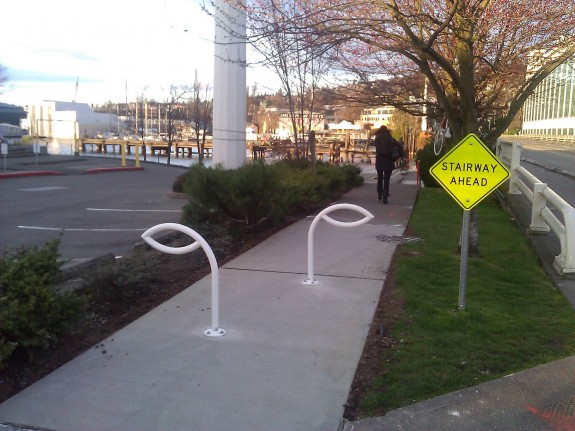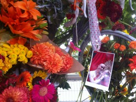
The ghost bike remembering the life of Brian Fairbrother still hangs from a tree near the staircase that took his life.
Fairbrother, a longtime Espresso Vivace employee, crashed on the Fairview Ave N staircase August 30 and died nine days later at the age of 50. Though it remains unknown why he crashed, some people pointed out that it is difficult to see the staircase until you got close to it. The sidewalk is designated as a multi-use trail, yet there were no signs directing people on bikes to ride across the bridge rather than continue forward.
 Though we may never know for sure if this was the cause of the wreck, the city took action to address the issue. Shortly after the crash, the city installed a sign warning about the staircase ahead.
Now, two leaf-shaped metal barriers in the sidewalk serve as permanent barrier for people moving through the area.


Comments
26 responses to “New artsy barriers hope to prevent repeat of fall that killed Fairbrother”
are these on both sides of the depressed floating section of pathway? or just the Southern side?
They’re on both ends at the top of the stairs. I just saw them this morning on my ride in, glad to see reasonably quick action on the part of the city (and if it wasn’t the SDOT then whoever installed them).
Wasn’t SDOT told about this problem long before someone died here? And they only took action once that happened. Hardly seems quick to me.
Yes, they are on both sides. Saw them yesterday (Thursday).
A very elegant solution. Do you know if this was installed by SDOT?
Artsy is a pejorative term. These are beautiful and useful and may save lives. They don’t look like an official installation which makes them even more amazing.
I agree that they’re cool. I didn’t use “artsy” to say they are bad. Just to differentiate these barriers from, say, a highway barrier, which is ugly.
While “artsy” may be pejorative, I agree with the disparaging term for their looks. I do believe that they may be functionally beneficial, as blind steps are obviously a really bad thing.
As a driver or rider, I’m always interested in design decisions related to eye movements. A larger portion of my time is spent scanning the surface ahead of me, while significantly less time is spent scanning things at shoulder height, and items that were immediately recognized as static get less attention than things in motion.
A stop symbol, or bicycle do-not-enter symbol would grab my attention more than a sign with pure text. The structures directly in the path certainly get my attention.
Glad to see something done, but those strike me as “artsy” in the pejorative sense. Public art is good in my book, but better when it does not diminish utility of a public trail. There’s no need for a “full maze” barrier when a simple post will do, and the post would not interupt side-by-side or passing passers-by. And still no “sidewalk braille” pad. I’d rather see several other additional stair cases marked with a standard bollard-and-braille than just this one all gussied up with custom hardware, and art installed beside the path.
To me they look like eyes, an appropriate shape?
They also have sharp angles at toddler head height, not so good as those of us presently or formerly in charge of little ones may worry. Little kids on paths have a tendency to charge ahead and bonk into things.
Anyway, no way to drive past ’em quickly without really making an effort.
Poor guy, he looks familiar to me I think I used to get coffee from him. RIP. To the toddler concern, I have one, she’d probably like to swing on them, should be fine.
I like them. A bit of reflective tape (white to match the paint) and I’d call them good to go.
Um, they violate the Americans with Disabilities Act. They are not detectable with a cane. There are certain dimensions considered detectable (protrude 4 inches from a vertical post, or have a low horizontal bar below an obstruction), but these are WAY out of compliance. Simply removing parts of the sidewalk might have been better. But thanks for doing something.
So put some flower pots under them. The safest option, of course, would be to ensconce all humans in a protective air-filtered padded cage from cradle to grave, thus allowing them to roll about the landscape without risk of injury.
Removing parts of the sidewalk would be better for someone using a cane?
They could easily add on an additional decorative flourish at the bottom, perhaps a stylized leaf, that makes the obstruction cane-detectable.
It would arguably make them more balanced looking anyway, and could increase the structural integrity, adding another anchor point at the full width of the piece. To me, these barriers look like a young bean plant just sprouting; the addition of a leaf coming up from the ground seems only natural.
I’m a little surprised the designer didn’t think of this in the first place.
Apparently we’ve all forgotten about all the pedestrians who are going to crack knee caps and groin areas when they don’t notice these white metal objects sticking up in the middle of the sidewalk. This will especially be a problem for the folks typing away on their iPhones and Blackberrys.
Grasping at straws. These are no worse than the many obstructions pedestrians must contend with on a daily basis. Nice try, though.
These same barriers are needed on Holgate where the road touches down from Beacon Hill to the SODO Flats. The sidewalk there does the same thing. There is a sign posted, “Stairs Ahead”, that appears to be new. Not sure a sign would slow slow down a fast-moving biker on the steep decline.
To hell with folks typing away on their iPhones and Blackberrys. Any intelligent person is watching where they’re going.
The world at large is not the safest place. Just be aware of your own surroundings!
As someone who also fell on those steps while riding there the first time, I’m glad to see these installed.
I’m interested in your comment as I too was riding with a friend and almost toppled down the surprise staircase that suddenly appeared out of nowhere. You don’t expect to see a set of stairs on a sidewalk. This is inattentional blindness like the gorilla on the basketball court (if you know that experiment and video – if not check out YouTube). I’m curious, when something in a city is bad or dangerous (as I can think of other places today), who would you expect to call? I wanted to call somebody, but didn’t know who. Did you have the same thought?
it’s heartening to see the city take steps to address the problem down there, but i’m becoming skeptical of placing hard obstacles in bicycle paths, especially oddly shaped obstacles like these. that said, these are better than nothing.
Powerful. They offer a moment of reflection and attention to any otherwise straight-forward-moving person. I do agree with Simon and Timmy, though, that their ability to be detected with a long cane (white cane) is limited. It could be injurious to a cane user or someone with low vision who misses it. I like the idea of having another piece to help it terminate to the ground. The white reflective tape would help (if not already there). Certainly seems the intent is to increase safety and beauty. Just needs a tweak.
[…] missed an unmarked turn into the bike path on the bridge and crashed on the stairs. The city has since installed simple artsy barriers to prevent a similar […]