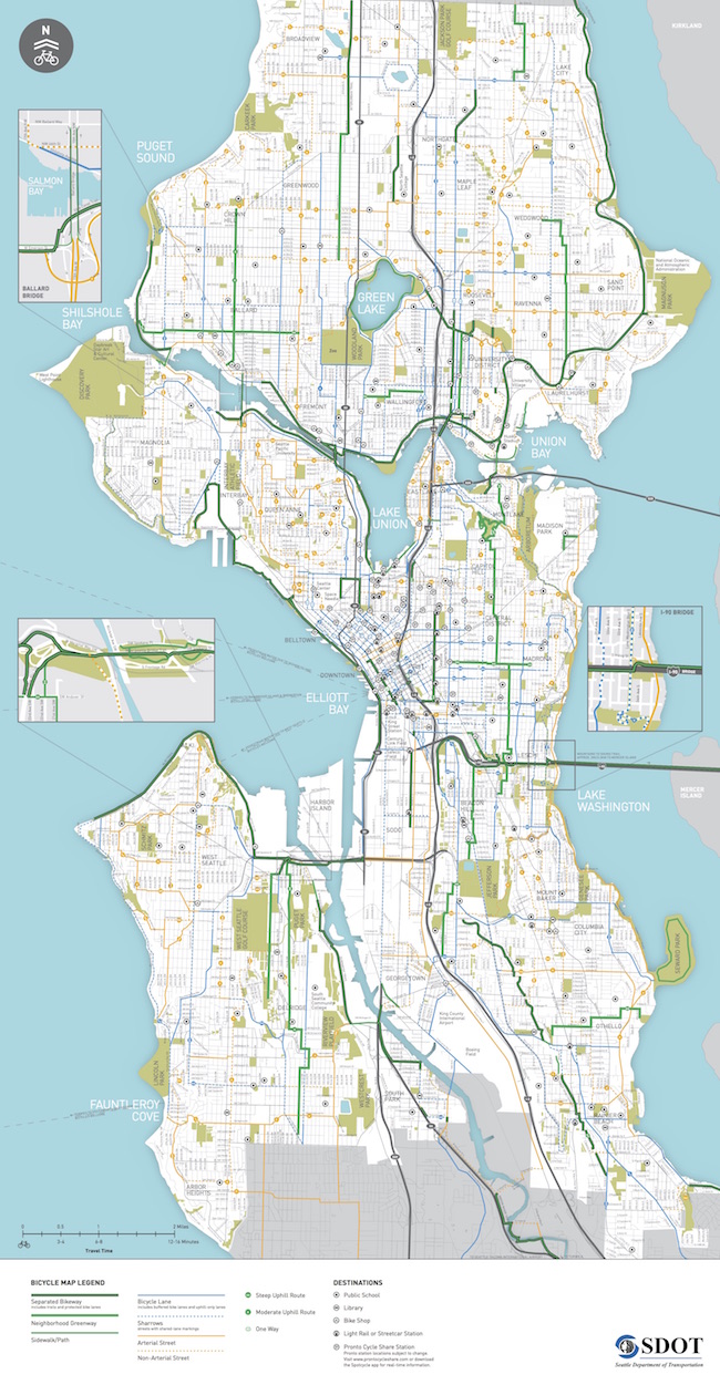
 The 2016 bike map is now out (a little late, yes), and it represents some quality steps towards a more usable routing tool.
You can download the PDF or even order a free physical copy via the SDOT bike map webpage.
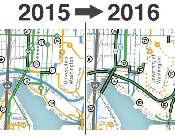
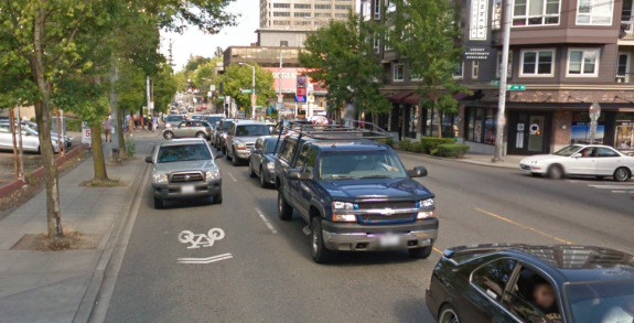
We were pretty critical of the 2015 map because it overstated the completeness and comfort of the city’s actual bike network. Busy streets marked with sharrows were given nearly the same prominence as streets with bike lanes, for example. Neighborhood greenways were dotted, which downplayed their comfort level. Looking at the 2015 map above, you might think NE 45th Street is a good bike route. Then you’d end up biking here:

But most importantly, it was hard to take a zoomed out look at the map and identify the most comfortable route between two places, which is pretty much the primary purpose of this thing.
The new map still marks busy streets with sharrows as blue, but they are significantly downplayed. Thick green lines now represent trails, protected bike lanes and neighborhood greenways. So if you glance at the map and find a solid green route connecting you and where you’re going, that’s the one you want. Easy!
 Of course I have nitpicks. Making a map is hard! Not all streets with sharrows are as stressful as NE 45th Street, and not all paint-only bike lines are equally comfortable (in the new map, the bike lanes on Dexter and the barely-existing bike lanes on MLK in the CD are given equal prominence, for example). But it’s hard for a map to pull out that granular level of detail and still be legible.
I still urge the city to drop sharrows entirely in the next map. They are irrelevant for the purposes of routing and should simply be included with the yellow streets, which designate popular bike routes that do not have bike facilities.
Another change in this map is that streets with a bike lane in one direction and sharrows the other way (usually busy streets on hills) are marked the same as streets with bike lanes in both directions. Honestly, this is fine with me because they are clearly given a secondary designation from the high-quality green routes. This somewhat outdated style of on-street route still does a lot of the heavy lifting for bike routing in the city, at least for people somewhat comfortable with city riding near traffic.
And finally, SDOT and Parks have got to get together and figure out how to show bike routes that go through city park land. Many of my favorite and most-used bike routes are not on this map at all because they go through a park (Jefferson Park, for example, or cutting through Roanoke Park to get from Interlaken to the U Bridge).
What are your thoughts on the new map? Overall, it’s great upgrade. Big ups to SDOT’s Kyle Rowe for his work on it.


Comments
35 responses to “Seattle’s new bike map much more legible, still needs to ditch the sharrows”
Map is excellent – I agree dropping the sharrows is essential on the next version.
I would like a Google maps layer and the ability to select views per the map legend.
See College Way on there north of Green Lake? Notice how it’s marked as a Separated Bikeway? That’s a bike route that’s a PBL in one direction, and a buffered bike lane (paint-only) in the other direction. It was a fantastic upgrade (I wrote about it here: http://www.seattlebikeblog.com/2015/06/11/salomon-seattles-newest-protected-bike-lane-just-part-of-normal-street-maintenance/), but it is definitely NOT separated. There are other places where that distinction is going to need to be made. Renton Ave S is getting a PBL in one direction and a paint-only bike lane (without even a buffer, as I recall) in the other.
Roosevelt Way now has a PBL, but that’s only in the south direction. North-bound, there’s nothing (well, a door-zone bike paint-only bike lane on 11th/12th). 2nd Ave downtown is also one-way, but has a two-way PBL. I fully support the simplicity of the new map; I think it looks great, and is a fantastic upgrade.
I’m not proposing we adjust the map; I want to see the streets themselves fixed. Streets with PBLs should have proper PBLs in both directions, and we should be pushing the city on that.
Sorry, not Renton Ave; it was some other project that I was thinking of that I can’t recall right now.
A big improvement!
Two tweaks to make it even better:
1) Dotted blue should be non-arterial streets commonly used by people biking (currently dotted orange).
2) Sharrows and arterials should be combined by be dotted orange.
This would further center the map in people centered design by giving people an easy way to quickly scan for routes that are comfortable for them:
Green routes: All ages and abilities
Blue routes: Enthused and confident
Orange: Brave and knowledgeable
Oh, and I forgot one of the other big upgrades: They removed the rail transit lines from the map. Those lines were confusing because it made them look like bike routes, which they specifically are not unless marked otherwise. This is a legibility improvement, though I wonder if there’s a way to mark known hazard spots. Is that going too far? Maybe.
Removing the lines themselves probably made sense, for the reasons you describe. The real transit sin here is the inclusion of streetcar stops. Who on earth would get off their bike to ride a streetcar down Broadway, that’s slower than just riding the protected bike trail that’s 15′ away? With the SLUT it’s a bit different, because there’s no safe, sane way to ride a bike through SLU, but that just highlights how asinine the SLU bike situation is.
The transit stops that should be highlighted on a bike map are those that are useful to bicyclists. Link is useful, the First Hill Streetcar is not. The Northgate Transit Center should be on the map, along a few of the bigger Transfer Points — Ballard & Market, The Junction, Campus Pkwy & The Ave, Westwood Village — where large amounts of genuinely-useful transit routes converge.
I’m not sure if any entire routes (besides Link) belong on this map, but if any do, they would be RapidRide on Aurora and 15th Ave, both of which are hell on a bike.
Bruce I agree with pretty much everything you are saying. But I do want to say that the bus-only lanes during rush hour have made Aurora quite reasonable during that time for the confident cyclist. Just beware merging traffic around 45th and take sidewalk over Aurora Bridge. I’ve never had any issue with merging around Roy when bus lane ends. Good uphill sprint to Denny. Cars change lanes to pass just fine.
To clarify this tangent, I’m talking southbound, where it is largely downhill and easy to go 25+ mph. Northbound, Fremont is a good choice, but I would like if they could make the 39th St shorter / more bike friendly.
This is pretty great. Thanks Kyle! I do agree with changing the sharrow colors and non-arterial routes as Gordon suggests.
The steep slope markers are wonderful. I wonder if a similar /!\ caution icon or similar could be added in a few places. For example I’m thinking the south end of the Ballard Bridge if that’s still a problem on an otherwise green route – I haven’t been there in a while.
It will be interesting to see how patterns change over time with new infrastructure. With the improved crossing of Pinehurst way, Hazel Wolf K-8 opening and Link at Northgate, I could see 115th in that area becoming dotted blue or orange over time. Otherwise, that’s a tricky area to navigate and this map represents it pretty acurately..
I’d like to see some map that has continuity with elsewhere in King County. Venturing into Shoreline, Seatac, etc., it is like I am in an unknown wild. Sometimes you can find maps that have Edmonds or Burien or others, but the unincorporated gaps are a big problem.
In addition to maps, i would like to see more on-street signage. If I’m at Mohai going to SAM, I should not need a map, and I should not get suckered into the Westlake death trap.
I’m concerned that, just eyeballing this map, I found several factual errors…
… which is to say nothing of the many places where the map emphasizes the wrong routes or classifies routes in questionable ways having more to do with city departments than the experience of riding the routes.
I generally agree about removing sharrows from the map, but I do think there are varying degrees of Sharrows. The one that comes to mind is Magnolia Blvd along the Bluff. This is a major cycling destination, maybe not all ages, but the kind of road that deserves to be on a bike map. There’s a big difference between that street and 45th.
wait, we have a separated bike lane on the downtown waterfront?
SDOT likes to pretend that the little paved path that runs alongside the viaduct is a separated bike path (despite the fact that it is generally swarming with pedestrians and intermittently blocked by construction)
Even that path only goes as far north as Bell Street. Between Bell and Broad there are the general-purpose lanes and the west sidewalk, that’s it. Drawing that section as a “trail” instead of a “sidewalk trail” would be inconsistent with the logic of the rest of the map… if there was any consistency or logic to these distinctions in the first place.
SDOT mixed up this map with the 2017 proposal map. (Sarcasm, in case any of you are taking me seriously.)
The all ages-and-abilities crowd LOVES bike paths swarming with pedestrians. This totally should be on the map.
While it might require Council action, or at least a strong arm from the Mayor’s office, a better solution for bike routes managed by Parks is to take them away from Parks and put them under SDOT.
While SDOT still has a habit of cutting corners, they are at least familiar with what NACTO, AASHTO, and MUTCD standards say you’re supposed to do and what you’re not supposed to do. Too many Parks-managed facilities still have aesthetically-pleasing dark wooden bollards without reflectors, pretty overgrown shrubs blocking sight-lines at intersections, substandard lane widths and nonstandard markings, etc.
If you’re going to show a facility as being suitable for bicycle transportation, it should be designed and maintained by an agency that understands transportation.
Also nighttime riding conditions. SDOT facilities aren’t always good, but every Parks facility I’m aware of is terrible. The Elliot Bay Trail is a poster child for awful night riding conditions.
And many parks technically close at night. It’s questionable whether anything that’s closed at night should be listed. This includes many important regional trails. Maybe the embarrassment of having to leave them off maps because of draconian parks regulations would light a fire under the asses of someone that could get the rules changed.
Hear Hear, SDOT not Parks should take over bike trails. I hate the root heaves, dark bollards, and inconsistent intersection signage (stop/yield/uncontrolled) that seems to defy logic. There’s also logical seasonal maintenance that wouldn’t be hard to do well like mowing blackberry vines in early-mid summer or removing leaves in the fall that never seems to happen without sustained complaints.
Bike Snob NYC’s comment from yesterday’s post seems apropos:
I’m sure the advocacy community will take my quote to mean I’m a proponent of sharrows (in the bike advocacy world sharrows are almost as bad as swastikas) and punish me accordingly.
http://bikesnobnyc.blogspot.com/2016/09/too-much-fred-for-one-head.html
Sharrows are fine and can be very useful. They are just not an indication of a complete all-abilities bike infrastructure.
Yes, but why obvious inaccuracies like the missing corners from the steep I-90 cap trail to Rainier multi-use then Hiawatha. The path is on the map but the corners have been rounded away for the heavy bordered green line.
Another error: it shows a greenway on 5th N along the seattle center. One block of that exists, the rest is purely imagination.
Sharrows are a political tool that has allowed city leadership to boast of doing far more for cycling in the city than they actually have. They achieve nothing. There is no place for them on any map.
Though I prefer sharrows to be augmented with BMUFL signs, when used appropriately, they are effective in suggesting the safest lane position of the cyclist and reminding drivers that the cyclists belong there. Most greenways have sharrows on them. Maybe your complaint is that the painting of sharrows is not coupled with engineering to calm traffic on the street, or the sharrow placement is dumb (not centered enough, in front of parked cars, etc.).
Still, there is another very important use of sharrows that I hope the city keeps doing: to get faster cyclist traffic off of crowded multi-use trails, for example, the sharrows on Alki/Harbor Ave. Likewise I would love calming and sharrows, and in some cases fixing rough roads, in a variety of places adjacent to slower trails or cycletracks, including 2nd Ave N, Westlake Ave, Northlake Ave, 34th St, and Sandpoint Rd. As a confident cyclist, I still want to know what roads without bicycle lanes are better for cyclists than other such roads, and I want car drivers to be reminded that I belong there.
While you wouldn’t know it from the spin when it was published earlier this year, the recent study out of Chicago actually showed that sharrows do improve safety.
They don’t improve safety *as much* as bike lanes, but then they’re not used on the same streets as bike lanes — in the Chicago study, bike lanes were installed on streets with higher crash rates, sharrows on streets with lower crash rates.
Streets that had higher crash rates had more room for improvement than streets with lower crash rates, of course, and they did see a greater percentage reduction in crash rates.
But the streets with sharrows did show safety improvements, and they remained safer than streets with bike lanes.
That’s consistent with other peer-reviewed studies around the U.S. — sharrows do improve safety for cyclists who use those routes.
That doesn’t mean they’re a substitute for separated facilities for more vulnerable users, but claims that sharrows are worthless have been thoroughly debunked.
I don’t hate sharrows except when they are used as an excuse to not do something more bold.
Whether sharrows can be useful or not is a different debate from whether there’s any point to noting their presence on the bike map. I can’t imagine a scenario where someone would change their routing in order to ride on a busy street with sharrows. It just seems irrelevant information for map users. It’s useful to include streets like NE 45th as a yellow street because it would show that 45th is one of the few streets that crosses the freeway. But highlighting the street’s sharrows? Pointless and maybe even misleading since 40th could be a better option for their trip and has no sharrows.
Agree 100%
That makes a lot of sense, Josh. Thanks for describing the differences.
I agree, sharrows themselves don’t deserve to be on the map — rather, safer streets should be emphasized on the map, and those safer streets should *also* be considered as potential candidates for sharrows. But the sharrows themselves shouldn’t be a map category.
That’s especially true because sharrows can be used for many different purposes.
Some sharrows are used to illustrate a workaround for a known hazard, like bad streetcar crossings. It would be insane to consider bug documentation to be a feature rather than an admission of failure, but that’s what happens if you show sharrows as an asset.
Some cities use sharrows on streets with cycletracks, to remind drivers that cyclists aren’t required to use separated facilities. It would be great if SDOT would start doing this on any street with separated paths, because far too many drivers expect *all* cyclists to use paths that aren’t safe at higher speeds and that don’t serve all destinations along a street. But would you want 2nd Ave marked as a sharrowed route, or as a cycletrack route? 2nd Ave should have sharrows, sure, but as a reminder to drivers, not as a facility for cyclists.
The map claims there are sharrows guiding the path between Rainier beach, thru Columbia City into Mount Baker. There are none on that route.
There are a handful of tiny bike circle things along a few points, but nothing like a path that someone could follow without getting lost.
SDOT is taking credit for “infrastructure” that doesn’t exist.
Also, the bike lane on Henderson in R Beach is so faded that it is literally hard to see from a bike, and impossible from a car.
Meh
It is somewhat ironic that the city has just produced a good map at a time when increasingly few people use them. We need an app not a map.
The green route is not necessarily the one “you” want–it depends on your priorities, proficiency and risk tolerance.
Sharrows are great for those who feel comfortable using them, because they frequently designate the fastest/least objectionable option for getting from A to B and inform drivers that bikes have a right to be there.
This post’s call to delete sharrows from the map is premised on the assumption that there is a significant group of people who don’t know that sharrows are frequently placed on busy streets. But who are these people?
If such people existed, then some of them might briefly find themselves in a situation where they didn’t feel comfortable because sharrows are marked on the bike map.
But everyone with even the slightest experience of streets in Seattle (or other American cities)–whether they are walking, driving or taking the bus–knows that sharrows are most frequently placed on busy streets. Finding sharrows on a busy street should not be a surprise to anyone.
Once again, this blog is pursuing its agenda to *remove* accurate information about bicycle facilities from the map, simply because it will not be useful to *some* users. This merely goes to show that in order to prove your bona fides as a bicycle advocate you have to hate on sharrows. It would seem that for whatever reason, to establish membership in this group, it is important to demonstrate indifference to the concerns of all but the most inexperienced and timid of cyclists.