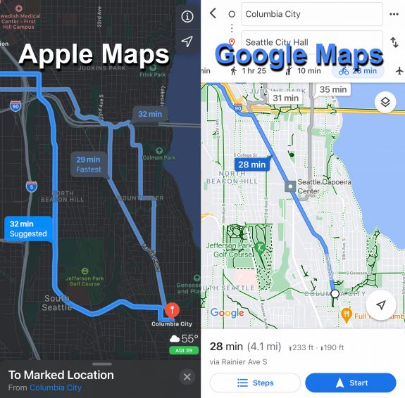
 Eight years after Google Maps introduced biking directions in its iPhone app, Apple Maps has finally introduced the feature. And much like the Google version, it is…OK.
When Google first introduced biking directions, it wasn’t perfect. The route decisions were rarely what I would choose, and sometimes it chose very busy streets. But at least it gave a biking option and a time estimate, which were very useful. It was a promising start, and I was hoping that the company would continuously improve the service so it would more consistently find high-quality routes. But like so many Google services, the company has let the feature languish with very few if any improvements (they improve the map data, like which streets are one-way, etc, but the way it makes routing decisions is much the same).
Apple Maps also gives OK bicycling directions. They are almost never the routes I would choose, but at least they usually work. Both services offer information on elevation changes and give a couple different routes to choose from.
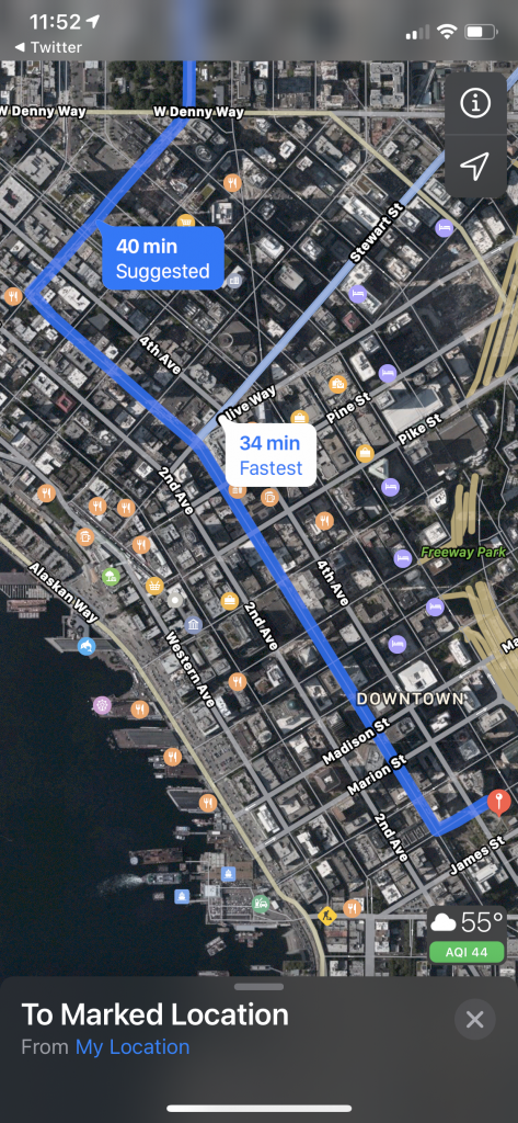
Apple does offer a couple interesting features that Google lacks, like options to avoid hills and busy streets, but they seem to be a bit confused by Seattle’s complicated geography. For example, if you select either “avoid hills” or “avoid busy roads,” it will suggest taking 3rd Avenue downtown rather than the 2nd Avenue protected bike lane.
 I’m guessing they have plugged some kind of traffic data into this, perhaps gathered from people driving with Apple Maps directions or from TomTom, to determine that 3rd Avenue is not a busy street. Unfortunately, they didn’t account for the fact that it’s a major bus corridor with car restrictions (thus the lower vehicle use). So sure, you can bike on 3rd, but I would suggest 2nd for most situations because of the bike lane.
I like the idea behind the options to avoid busy roads and hills, and hopefully Apple continues to work on the features to make them more effective.
I also hope that Apple entering this battle lights a fire under Google to put a team on improving their bicycle directions engine. Google’s map data, especially for short trails and such, is still unparalleled, so they should have an advantage over Apple here. They also have Street View images for many trails, which can be very helpful. But they are still missing features to help people find routes that better fit their biking preferences, like options to avoid hills or busy streets. Let’s see Google Maps try to show Apple Maps how to do it right.
But look again at the comparison at the top of this story. Neither app has a good route for biking from Columbia City to downtown. That may be because there is no obviously great option, but I would never suggest any of the routes either app found. Apple Maps seems to not know how to route people though Jefferson Park, and Google doesn’t even bother to offer any options that don’t take Rainier Ave much of the way. I have to give the win here to Apple because it at least offers more options, not bad for a service on day 1 compared to a service on day 2,845.
The biggest feature Apple is missing compared to Google is the biking layer. Routing information is somewhat useful, but I find the best way to fine-tune your route is to look at all the available trails and bike lanes on top of the satellite image. As you can see from the comparison image at the top, simply having the trails and bike routes marked out in Google makes finding your own route so much easier than the sleek Apple Map. This seems like a feature Apple could add without too much trouble since the routing data must be based on a biking layer that is invisible to users.
I welcome competition in the bike directions space. As far as I’m concerned, neither company can claim to be the best right now, and there’s a lot of room to improve. There are plenty of people out there with a bike in the garage who are nervous about biking somewhere they haven’t been before because they don’t want to get lost or stuck on a super busy street. A mapping app that can offer more options for people to find routes that more consistently serve their biking preferences would be a great way to help people expand the number of trips they make by bike. Just telling people to bike down busy Rainier Ave isn’t going to cut it. People already know where Rainier Ave goes. If they are looking up bike directions, odds are good that they want to find a different option.
The other option for best bike routing app is Ride With GPS. It is not nearly as user-friendly as Google Maps or Apple Maps, and the mobile routing feature requires a $50 per year subscription (but the free version is still useful). It’s the most detailed and versatile option, and includes a social route-sharing element that is really cool.
Do you have a favorite bike routing app that I missed? Let us know in the comments below.


Comments
10 responses to “Apple Maps now has bicycling directions, and they are OK compared to Google’s dusty service”
The route planning for Seattle in Cycle Streets (based on Open Street Map data) is the best I’ve seen. The UI is terrible (clear route, set point a, set point b, plan route) but the there are settings for faster, safer or a mix, you can set your pace to get better time estimates. My biggest complaint is it doesn’t take steep hills into account, but otherwise the safest routes it chooses are usually very close to what I would recommend myself.
https://apps.apple.com/gb/app/cyclestreets-journey-planner/id391984737
My beef with Google is that since Covid began weird things have happened with their mapping of some bike trails. I know they accept public feedback so maybe they are getting trolled and not doing any ground checking. Or even looking at their own Street Views or consulting their own local employees who bike. Here are just two examples I see today:
There is a gap in the Burke between 25th Ave NE and 30th/Union Bay NE.
The Duwamish Trail along W Marginal Way SW is mapped in the road (virtually a freeway). Along Highland east of Marginal the trail is mapped both on the sidewalk (correct) and in the road (wrong).
I’ve reported these and similar errors but they keep coming back.
Yeah, the recent errors on the Burke Gilman are really annoying. This is making route mapping with Ride with GPS more difficult than it needs to be.
The base maps for both Google and Apple seem to give short shrift to trails. At least for Burke-Gilman between Fremont and UW, when you first open the map it’s omitted entirely. Zoom in a couple of times and you see the facility but no label. Zoom in a couple more times and you finally see the label. This policy probably fails objective criteria such as number of trips on a facility, as the smallest of streets are displayed at the get-go. Even when you ask for biking directions the labeling makes it seem as if directing you to a parallel street. It’s as if the map makers don’t think of a bike trail as an actual transportation facility.
Thanks to technology, determining the best route in Seattle is actually a very simple process these days.
1. Look up directions on Google Maps.
2. Compare the suggested route to my personal knowledge about the route to assess the completeness of transportation infrastructure. Ask myself these questions about every segment of road between point A and point B: Do all segments of road have sufficient infrastructure (e.g. protected bike lanes on arterials)? Are all intersections safe to cross? Do I know of an active construction project or current traffic conditions that might limit access to bicycle infrastructure?
3. For any portions of the route that I am unfamiliar with, look up the route on Google Street View for signs of bicycle infrastructure in order to assess the safety of the route.
4. Decide that the suggested route is ridiculously unsafe. Recognize that even the best technology can’t fix the disconnected hodgepodge that makes up the city’s bike network.
5. Look at the map to find alternative routes that avoid busy streets and inadequate infrastructure and are flatter.
6. Determine a route that seems least likely to lead to death.
I think the greatest benefit these services could provide is to minimize the reliance on the “sharrows” data provided by the city. Google, in particular, likes to think of sharrow routes as good places to bike, when we know that Seattle would gladly put sharrows on I-5, tell people it cost $500 million and then gleefully claim to be fulfilling the “Move Seattle” levy goals.
Sharrows, I suppose, are better than nothing, but in West Seattle, for example, Apple and Google are flat-out ignoring the neighborhood greenway and telling people who want to go from High Point to the Junction to take 35th Ave SW, which of course is a goddamn death trap. Same goes for Sylvan, which has “sharrows” but is basically a stretch of road filled with drivers looking to murder cyclists just to get past the bridge detour faster.
Rather than binary “avoid hills/traffic” (or not) options, I’d like to see sliders to the effect of “how much do you hate hills” and “how confident are you in traffic”, each with a range of possible values to cover a range of cycling abilities, experiences, equipment, and preferences. I’d also like to see these apps be able to learn from a user’s behavior (opt-in, for privacy reasons), because I expect people would have difficulty quantifying exactly where they are on the scale. By studying the routes a user chooses and comparing to what the routing engine would suggest, the app could create a hilliness/traffic comfortability score for the user, instead of them having to score themself. Maybe even have multiple profiles that could be selected between, as I imagine some people cycle differently when they have their kids on the back of their cargo e-bike than when they’re out for a couple hours on their road bike.
This is a good idea and is really what it would take to make it actually work for people.
For instance, I was rolling my eyes at Tom’s complaint about being routed down 3rd, since I find 3rd far safer and comfortable than the frankly quite stressful PBL on 2nd.
For those comfortable sharing the road, Strava’s heatmap-based routing actually does a pretty reasonable job of suggesting the routes that I would intuitively otherwise choose. Not perfect (same basemap issues that other folks mentioned), but pretty good. Atrocious on mobile, though, unfortunately.
Also important to biking is the apps’ approaches to car navigation. The apps are constantly telling drivers to cut through neighborhood streets, often to avoid one traffic signal or because curves in the road make the cut through route 50 feet shorter. I’ve witnessed this multiple times as a passenger in a car driven by someone blindly following their phone.
The fewer cars the apps shunt onto biking routes who don’t really need to be there, the better.
Not an app, but cycle.travel produces the most reasonable routes I’ve seen. It’s based on OpenStreetMap road data, so if you find issues like missing bike lanes, you can fix them yourself.