The Washington Traffic Safety Commission has put together a new dashboard breaking down the conditions surrounding traffic deaths of people walking, biking or rolling. The data covers ten years from 2012 through 2021 (2022 data is not yet finalized), and there are some undeniable trends that point to the problems.
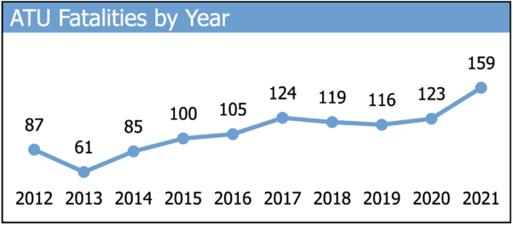
First off, the worst chart in the whole dashboard shows that walking, biking and rolling deaths are trending in a horrible direction (the state uses the term “active transportation users” abbreviated “ATU”):
 This chart represents an emergency. 2013 was not exactly some stone age distant past for Washington State, and yet its total of 61 deaths was nearly a third as many as in 2021. 2013 may be an outlier, but it’s evidence that such a number is achievable as a very short-term goal with zero of course being the long-term goal.
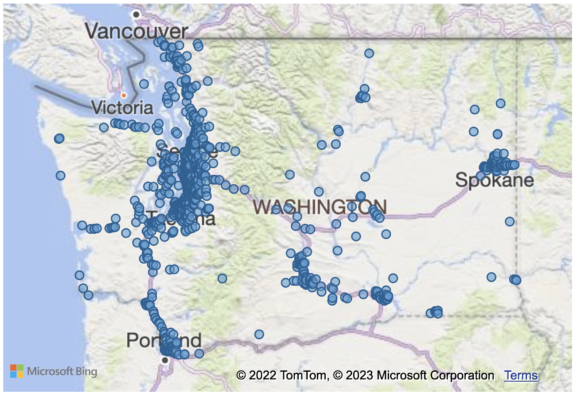
 A look at the overview map of fatality locations shows that the Puget Sound region is the epicenter of the crisis, which makes sense because it is also the largest population center in the state. The map also shows that deaths tend to follow heavily populated corridors along highways. This doesn’t mean the deaths are all on the highways themselves, but they tend to be near them.

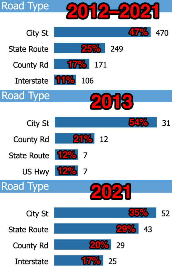
In fact, the “road type” box may show the biggest eye-opener of the whole dashboard, at least from my initial reading of it. State Routes seem to be leading the increase in deaths, dramatically increasing their share of fatalities over the decade. While city a majority of walking, biking and rolling deaths occurred on city streets earlier in the decade (54% in 2013, for example), that number declined to 35% in 2021. Meanwhile, the share of deaths on state routes increased from 12% in 2013 to 29% in 2021. The total number of deaths on city streets did increase in those years, but not nearly as quickly as on State Routes. Note that these figures do not normalize for population, which increased 15% in Washington between the 2010 and 2020 Censuses. However, population growth does not begin to account for the increase in traffic deaths here.
There is a lot more to analyze with this dashboard. Someone with more sophisticated data analytics skills may be able to pick out many more trends. For example, cross-referencing race, age, land use, area population and vehicle type could perhaps lead to more insight into what is happening.
Washington needs to reverse this trend. The loss of every single person behind every single dot on this map is too much to bear.


